Task-Driven Comparison of Topic Models
This work explores the ability to compare topic models in a task-driven way. It was developed by Eric Alexander and Michael Gleicher at the University of Wisconsin-Madison as part of the Visualizing English Print project.
This page is intended to serve as a supplement to a publication presented at IEEE VAST 2015. The associated publication can be found here.
Problem motivation
With the increasing popularity of probabilistic topic modeling in large-scale text analysis, visual tools for exposing a single model to a researcher are becoming quite common. However, these tools rarely facilitate direct comparison between models. Such comparison can be valuable for picking the right model from the parameter space, validating that findings are consistent across runs, and evaluating different modeling or pre-processing techniques. While numerical metrics for contrasting models exist, these often fail to align with human judgments and may give little insight into what causes the differences.
Difference is only significant to the degree that it affects what the user will actually do with the model. Therefore, we have set out to support task-driven topic model comparison by compiling a set of common topic model tasks, determining corresponding comparison tasks, and suggesting visual techniques for performing them.
The encodings
From our own experience, we derived a set of single-model tasks and corresponding comparison tasks that we believe cover the majority of use cases (though this list is not completely exhaustive):
| Single-model task | Model comparison task |
|---|---|
| Understanding topics | Topic alignment |
| Understanding document similarity | Distance comparison |
| Understanding change | Timeline comparison |
Full descriptions of these tasks and the techniques with which we address them are in the paper. Here, we offer brief descriptions of the main encodings.
Understanding topics: Topic alignment diagrams
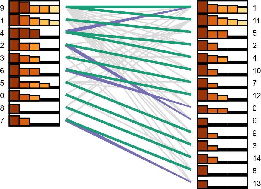
Our bipartite topic alignment diagrams indicate matches of different strengths (green as a two-directional match, purple as a one-directional match, and gray as a weak match). The bar charts next to each topic show the strength of the top five matches (with bar height encoding strength and color used to show rank so that ties are salient). Topics exhibiting multiple close matches (e.g. Topic 4 on the left) may be instances of merged concepts to explore more closely.
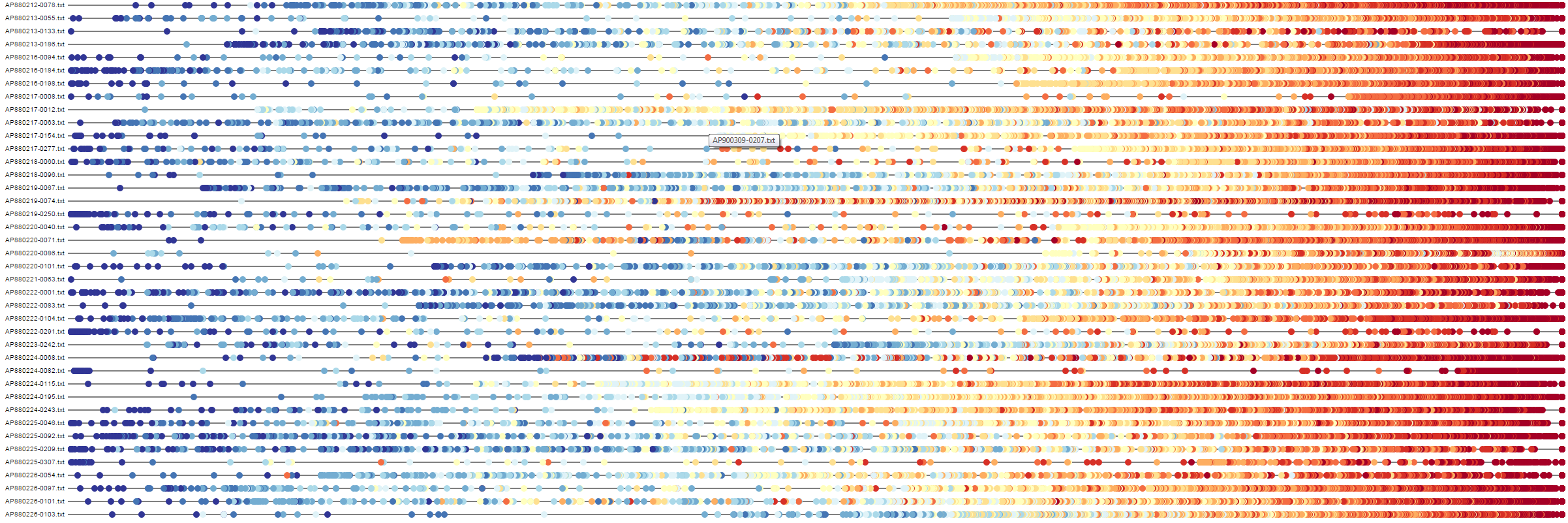
Understanding document similarity: Buddy plots
Buddy plots encode the distances of corpus documents away from an individual reference document. By using both position and color, buddy plots can combine multiple sets of distances within a single line. Above, we have buddy plots comparing two models built on the works of William Shakespeare. Color indicates the distance of each document from each reference document in the first model (blue as close, red as far), while position indicates the distance of each document from each reference document in the second model.
Understanding change: Asymmetrical topic flows
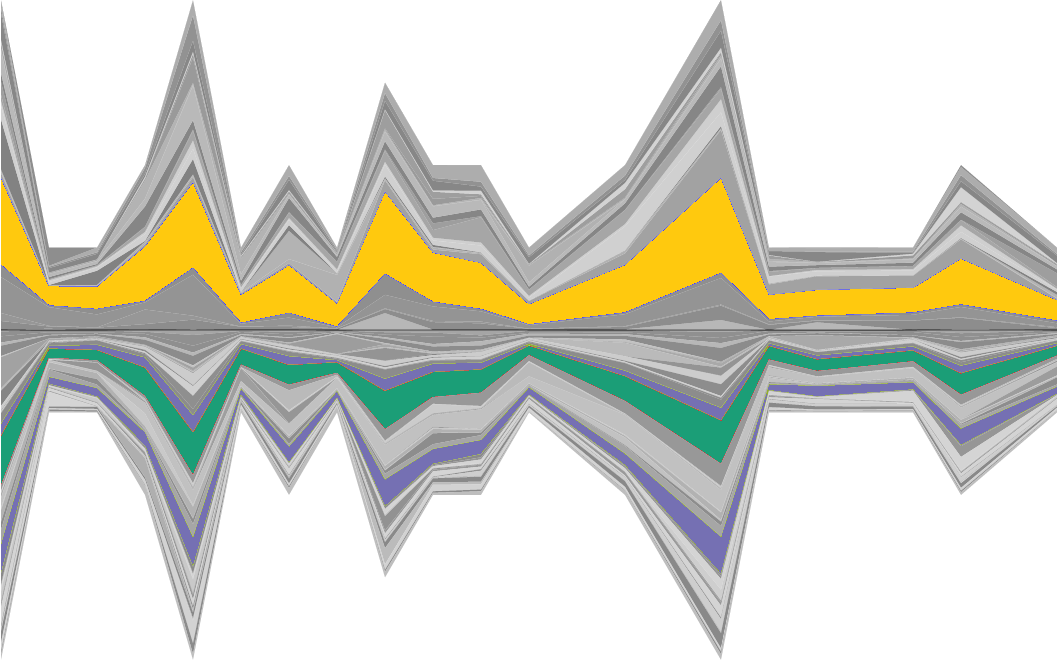
Asymmetrical topic flow diagrams show how topics change over time within two models. The horizontal axis encodes time; width of bands above the axis indicate topic proportions from one model while those below the axis indicate proportions from the other model. Hovering over an individual topic highlights it in yellow and highlights any aligned topics from the other model (green for a two-way match, purple for a one-way match).
Sample comparisons
About us
This work was done at the University of Wisconsin-Madison as part of the Visualizing English Print (VEP) project. The primary goal of the VEP project is to investigate ways of using data visualization principles to study literature from the Early Modern period (roughly the 15th to the 18th century).
This work was supported in part by NSF award IIS-1162037 and a grant from the Andrew W. Mellon Foundation.
Have any questions or comments? Feel free to contact us!